 Digitoria
WhatsApp
Websites / DIGITORIA JOURNAL
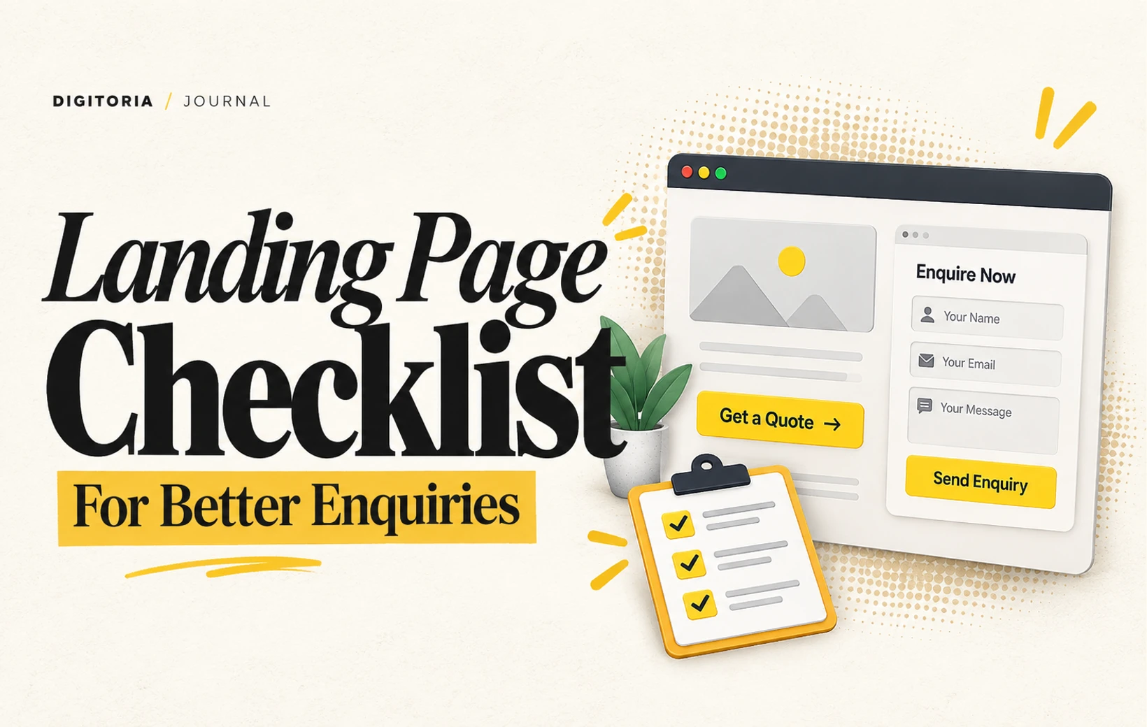
A Landing Page Checklist for Better Enquiries
Align the headline, proof and contact form so visitors can take a clear next step on mobile.
Keep the promise consistent
A landing page should continue the conversation started by the ad. If the ad offers a specific service, put that service in the opening heading and explain who it is for. Avoid making visitors infer the connection from a general company introduction. A focused page can still include brand personality without delaying the answer.
Explain before asking
Describe what the customer receives, the process and the information needed to begin. Add genuine work examples where they are relevant and you have permission to share them. If pricing depends on scope, explain what changes the scope instead of inventing a starting price. Address the questions a customer would normally ask before contacting you.
Design the next step
Use one primary action, such as requesting a consultation or sending a brief. Give form fields visible labels and ask only for useful information. Explain what happens after submission. Test missing fields, invalid email addresses and a successful submission; a button animation is not evidence that a message reached the team.
Measure and improve
Review the page on a narrow phone screen and a slow connection. Check readability, loading images and access to the contact action. Record relevant enquiries as well as total submissions. If people leave without acting, examine the offer and page clarity before adding more animations. Small, measurable changes are easier to evaluate than a complete redesign every week.